Turkish Airlines Rebrand
PROJECT Choose an airline or taxi/limo service and re-imagine it as a better, faster, stronger, version of itself.
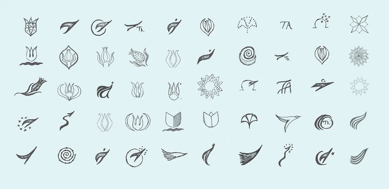
CONCEPT Turkish Airlines is the national airline of Turkey. It offers services to 304 destinations across the globe making it the largest carrier in the world. The airline, once plagued by safety and maintenance issues, has made huge improvements over the last decade to become an award-winning airline. Unfortunately their identity doesn’t match their current status, let alone the country they represent. With a focus on making the new brand as warm, friendly, and modern as the country and the people it represents, the new wordmark incorporates the shapes, domes and minarets, of the famous mosques found throughout the country. In addition, the tulip, a plant that is native to Turkey (not Denmark) and represented in many forms of decoration throughout Turkish history, replaces the non-native bird symbol that is currently in use. A rich red and turquoise were also chosen for their historical significance as the colors of the Ottoman empire.


